DIRECT MANIPULATION:
Definition and Overview
Visible Objects and Actions
A Transparent Interface
Metaphor
No Intermediaries
Like Driving a Car
Discussion
References
Graphic User Interface (GUI) has become a cornerstone of modern human-computer interface, including Xerox STAR, Apple computers, MicroSofts Windows and Hewlett Packards New Wave OS. A Microsoft study (1990) found that GUI users evidenced higher productivity, learned to do more in less time, and showed greater tendencies to self teach and explore than did CUI (Command User Interface) users. Apples Human Interface Guidelines stress the importance of GUI, and, specifically, of direct manipulation.
Central to the Apple Desktop Interface is direct manipulation, by the user, of graphic objects on the screen. The mouse, or other pointing device, lets the user point to objects, select objects with the click of a mouse, and choose actions to apply to the selected objects. Direct physical control over the work environment puts the user in command and optimizes the see-and-point style of interface. (Apple Computer, 1987)
Hypermedia authoring tools such as HyperCard and ToolBook offer easy access to graphic tools, programmable buttons and other objects which facilitate rapid creation and revision or refinement of direct manipulation interfaces. Availability of such tools is a boon to hypermedia developers but leaves them with the challenge of determining what direct manipulation really means and how to go about designing good direct manipulation interfaces.
Direct manipulation is a complex, compound, important and often poorly defined construct. This article describes and analyzes the most common definitions. In addition, it will consider elements of integrated graphic design and metaphor as they relate to direct manipulation. Definitions of DM have generally not focussed on graphics, for at least two reasons. DM definitions were formulated before hypermedia tools were available to provide easy incorporation of elegant graphics with flexible point and click interactivity. And, they were posited by theorists who are not graphic artists. An interface need not be GUI to be DM. But it often helps.
DM is generally described in academic human interface literature (e.g., Schneiderman, 1983 & 1987; Hutchins et al., 1986; Norman, 1988; Rafaeli, 1990) as encompassing the following characteristics:
These DM components will be considered separately, examining implications and issues.
The first component of DM defined by Schneiderman (1987) is visibility of objects and actions of interest. Tognazzini (1990) differentiates a visible user interface and a graphical user interface. While GUI makes use of graphical representations of objects, there may be many aspects of a GUI interface that remain invisible. In contrast, a visible interface always shows users where they are, where they are going and what objects and actions are available to them along the way. Thus, visible graphic DM interfaces are a special subset of GUI.
Norman (1988) urges software designers to make things visible. He differentiates knowledge in the world and knowledge in the head. Knowledge in the world is retrievable from the software environment and requires little learning or memory. It relies on the physical presence, or visibility of information. Software which relies on knowledge in the head, for example, command languages, can be efficient once learned, but is hard for first time users. The distinction is rarely absolute. Even if software relies on knowledge in the head, visible cues and reminders can be incorporated. Conversely, good DM interfaces which rely mostly on knowledge in the world may incorporate some elements which are not visible.
Norman further suggests that software designers make it easy for users to determine at any moment what actions are possible, creating constraints that make the user feel as if there is only one possible thing to do at a particular moment (the right thing). Users should be able to see what are the possible actions. When taking an action, they should be able to immediately see feedback about the results of that action.
Objects and actions are defined by the interface and may be completely different at different points within the interface. For example, within electronic mail interfaces, objects at one menu screen are the headlines of each new email letter received; actions include delete, read and file. At another point in the interface, there is one object, the text of a single received letter. Possible actions include page up, page down and return to the previous menu. The judgement of whether an interface is "visible"can differ at different points within the interface, based on the particular objects and actions available at any point in time.
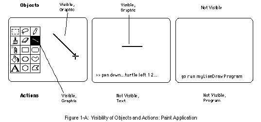
Even at a particular point in an interface, visibility is a compound concept. Either the objects, the actions, both or neither may be visible. Figures 1-A and 1-B illustrate different combinations of visibility for objects and actions. The 3 screen layouts in Figure 1-A compare different interfaces for drawing a straight line. The first interface demonstrates visible actions and objects, both of which are graphically represented. The second demonstrates visible objects with actions that are not visible but instead must be entered at a command prompt. The third interface represents batch processing of a compiled program, where neither the actions nor the objects are visible.
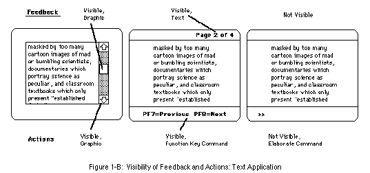
The 3 screen layouts in Figure 1-B compare interfaces for scrolling text, pointing out the visibility of a possible action (scroll up/scroll down) and feedback (where, within the text field, the currently displayed text is located). The first interface, a typical GUI scrolling field, has graphically visible actions (click on the up or down scroll arrows) Feedback about where within the field the current text is situated gets communicated graphically via the white square in between the up and down scrolling arrows. This square represents the location of the current text relative to the entire text of the field. The second interface uses text rather than graphics to make possible actions visible (PF7=Previous; PF8=Next). Textual feedback is also provided about the location of the current text within the document (Page 2 of 4). The third interface offers a command line with no visible actions. Users who know the language know to type scroll 25 to scroll down to line 25. There is no feedback about where within the document the onscreen text is situated.
Visibility may be accomplished through graphics, text and even sound. One is not by definition more visible than the other. Feedback is often auditory. Objects and actions can become visible by using text or graphics or sound or all three. Complimentary use of more than one channel to communicate is often desirable (Heeter and Gomes, 1991). Future interfaces will provide tactile cues.
Invoking a straightforward interpretation of visible, one could apply this criterion to an interface by asking: what are the objects; what are the actions; and can the user see, hear or otherwise perceive them? These questions have complicated answers.
Visibility seems simple enough: can you perceive something (yes or no)? But there are other dimensions of visibility, in addition to channel. Visibility is relative. A pull-down menu is somewhat less visible than a palette which is always onscreen. A list in scrolling field only part of which can be seen at a time is not quite as visible as a list which all fits on the screen. However, each of these conforms to the criterion of knowledge in the world rather than in the head, because they are retrievable from the interface environment.
Another dimension of visibility is organization. We arrange things in the physical world to provide visibility. A collection of tools can be piled into a drawer. Opening the drawer yields some visibility, with rummaging. A pegboard allows placement of the objects such that each can be seen. This visibility may be further enhanced with organizational strategies. A medium sized Phillips screwdriver is more visible (quickly identified) when placed between a large and small Phillips screwdriver than when placed between a hammer and a saw on a board displaying 20 tools.
Organization is a challenging component of visibility. Appropriate organization of visible objects or actions can enhance visibility. The creative organization of information actually creates new information about and beyond what is being organized. New organizational structures may bring to light new meaning. For example, on a GUI desktop, organization of files into either spatial proximity or labeled folders makes it easier to keep track of than if every file was shown at the same main level, creating a screen totally full of randomly placed icons. Wurtman (1989) claims there are only 5 ways of organizing: category, time, location, alphabet and continuum. Moreso than physical objects, digitally stored information can easily be organized in more than one way. Each vantage point, each mode of organization will create a new structure. And each new structure will enable you to see a different manner of meaning, acting as a new method of classification from which the whole can be grasped and understood (Wurtman, 1989).
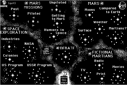
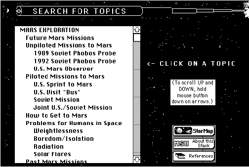
Figure 2 shows two interfaces which visibly represent the same 172-item menu in the software package, Mission to Mars! (1990). The top menu is an example of text and graphically organized DM. The same options as those available in the bottom menu are organized into "galactic clusters"and further into "solar systems"which show the amount of available information related to each theme. Clicking on a galaxy (major topic), sun (subtopic) or planet (specific content chunk) jumps to that section. Galaxies and webs are useful GUI DM structures for organizing information. The bottom menu is an example of textual DM, featuring a text scrolling field in which clicking on a word jumps to that topic. Subtopics are organized within the text field by content area. These two DM interfaces communicate different messages while serving the function of providing one-click access to the same information. The scrolling menu shows breadth of detailed information. Only part of the information is visible at any moment. In the galactic cluster, all is visible at one time, though with less detail. It communicates a sense of the scope of available content and its interrelationships.
When everything is visible, human memory is not a limiting factor. For now, screen size is probably the most limiting factor in DM design. Visible interfaces would be well suited to wall-sized screens or three dimensional spatial displays. With today's small screens, as the number of choices increases, a visible interface becomes less viable until a higher order organization and redefinition of objects is invented which once again allows for visible representation. The number of objects at the higher level may again exceed screen capacity, requiring another organizational shift or switch to a non-DM interface.
Rafaeli (1990) asserts that "DM is system transparency, a reduced imposition of system-centered structure." He describes DM as "allowing the semantics to upstage the syntax"of the task. Norman (1988) concurs. "The point cannot be overstressed: make the computer system invisible."An invisible DM interface is one in which the computer does not hinder the process being undertaken. This is an interesting directive for designers. It describes the absence of an attribute rather than the presence of one. Basically, in DM, the computer is supposed to stop getting in the way.
Only 2 of 4 criteria into defining DM, designers are being instructed to incorporate visible objects and actions into an invisible interface. DM has been referred to as the "holy grail"of interface design (Erickson, 1990), perhaps because it is impossible to meet all of its criteria completely. What does an invisible interface mean?
When people cite examples of "invisible"interfaces, they turn to interfaces people already know and use. Natural language, voice recognition and handwriting recognition sound like appealing interfaces because users wouldn't have to learn anything new. Rafaeli (1985) defines a measure of the quality of human-computer interaction as the degree to which it resembles human discourse. The implicit (and questionable) assumption is that human discourse is the ultimate transparent interface toward which all other interfaces should strive. The assumption is broadly shared and rarely questioned. For example, the Interactivity Manual for MacroMind Director 2.0 states that HyperTalk and Lingo are "strongly English-like" programming languages which are "designed to sound and feel as much like interpersonal communication as possible." Apparently this is good.
I see this yearning to simulate human communication as the "WYSIWYG" of interactivity design. WYSIWYG (What You See Is What You Get) is a standard of screen display which means that what you see on the screen is what you get on the printout. Early word processors and page layout design packages did not have this feature; what users saw on the screen was a mess of control characters, a single font, meaningless spacing, etc. Although WYSIWYG was an important advance in computing, it is not the pinnacle of screen display evolution, as Ted Nelson (1990) points out. "So we've taken a powerful computer and turned it into a paper simulator. Terrific!" Before WYSIWYG, desktop publishing on a computer was awkward. Having achieved WYSIWYG, computing can look beyond paper simulation, into realms of interactivity, animation and simulation which cannot be represented in other media. Similarly, with DM and interactive interfaces, hopefully we will start improving on as well as attempting to simulate everyday communication modes by changing the rules, imposing limits and providing functionality to focus on and facilitate a chosen task.
The best transparent DM system will not necessarily be a simulation of the real world or of human discourse. In fact, a human communication-like invisible interface does not meet the inverse DM criterion of visibility. There are other means of achieving or approaching transparent interfaces, such as familiarity, metaphor and context.
Familiarity is a safe way to try for invisibility. DM invisibility argues for commonality of object and action representation across interfaces. Invisibility is in part a user-specific, subjective quality. Every piece of software a user has used affects the way she or he experiences the "invisibility" of a new piece of software. That familiarity varies across users. More broadly, familiarity relates to the software industry as a whole. A bad interface, if familiar, is in some ways more invisible than a radically improved new interface, particularly in the short run. Any symbol is familiar once you know what it means (Rosendahl-Kreitman, 1990). Lawsuits trying to protect the "look and feel" of software are probably not in the best interest of the user. They interfere with the natural evolution of hypermedia as a communication medium, disrupting natural synergies for invisible interfaces by preventing developers from directly reusing methods that are familiar and work.
More highly evolved communication media, such as newspapers and television, package information into structured, stylized formats which have made themselves familiar through repetition and conformity. Oren (1990) refers to them as genres: "conventional, familiar ways of setting expectations of the experience to come."Mature media have well established genres, such as situation comedies, talk shows and newspaper sports sections. According to Oren, "genre recognition invokes our memories of conventional stories, characters and handling of form and leaves us free to enjoy the nuances of a story rather than relearning basics."There are real world "genres"as well. For example, plays, bookstores, amusement parks, classrooms and ice cream shops all imply a strong set of expectations about what the experience will be like and how it will proceed.
The genres for hypermedia are still evolving. Most users have limited exposure to hypermedia. Because of limited exposure, there is wide divergence of expectations across different users. A single experience may have a major impact on a particular user's expectations. For some users, the term "interactive video"conjures an image of a television show interrupted by occasional points for interaction; for others, "interactive video"means a dominant computer component which occasionally accesses video. Edna Coffin's Educom-award-winning Hebrew instruction software is 20 hours of computer-based instruction which accesses a single half hour videodisc. There is not yet a "network standard"or set of genres for hypermedia. While most books, TV shows, lectures and even instruction manuals do not require an instruction manual, computer software bears the added burden of continually defining how to use itself. To some extent this need will lessen as hypermedia matures, but there will always be more potential variation and therefore greater need for self definition than there has been for other media.
Which of the following two interfaces is more transparent, and why?
Metaphor is a technique for invoking familiarity which helps compensate for the lack of hypermedia genres and also can provide broader benefits. According to Mountford (1990), "metaphors are powerful verbal and semantic tools for conveying both superficial and deep similarities between familiar and novel structures."Erickson (1990) defines metaphor as "an invisible web of terms and associations that underlie the way we speak and think about a concept."One use of metaphor is to cross media boundaries. Hypermedia designers create "electronic newspapers"or include "picture phones"in their hypermedia to "call"experts and ask their opinions. Metaphors are not limited to media. The Macintosh "desktop"invokes an a non-media real world comparison. Chen and Leahy (1990) discuss a "kitchen"metaphor as an alternative to the desktop.

Mountford (1990) suggests that metaphors "have two distinct but related uses in interface design: as cognitive aids to users, and as aids to creativity for designers."Metaphor can set user expectations about content ("this is like a newspaper") or about available controls ("these controls will let you fly a spaceship"). Metaphors can be represented with graphics, text, sound, etc. Not all graphics are used as metaphor. A graphic element may appear as a discrete illustration, unrelated to other graphic elements on the screen (see Figure 3); it may serve the role of decoration, communicating a tone or mood of the interface; or the graphic element may be integrated into the overall screen design, and perhaps even be a functional element of the interface.
Metaphors in hypermedia are approximations. Laurel (1991) raises objections to the use of metaphor. A problem with metaphors is that they are "like reality"only different. The problem lies in guessing what is different and what is the same. Laurel ponders that simile is a better term then metaphor, then cites Ted Nelson's proposition of the term "virtualities"as a further improvement. Virtuality refers to conceptual structure and feel, allowing construction of entirely new contexts, objects and actions that have never existed before. Metaphor, simile and virtualities are all symptomatic of a move toward approaching the computer "as a representer of a virtual world or system in which a person may interact more or less directly with that representation"(Laurel, 1991).
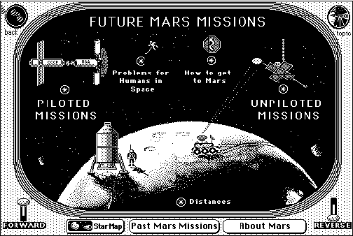
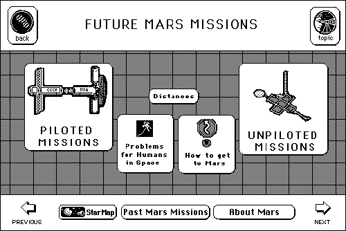
Figures 4, 5 and 6 present pairs of DM interfaces, with and without metaphor, which offer the same basic object and action choices. Reader are invited to evaluate for themselves which they feel is better. The interfaces in Figure 4 are menus of choices about Future Mars Missions (Mission to Mars!, 1990). The top menu uses the metaphor of a space ship control panel, embedding recurring command options (forward, reverse, back, topic, main star menu and related choices) into a control panel which surrounds a space ship window. The menu below was redesigned to remove the metaphor, leaving only "buttons"which serve the same functions. In both cases, the choices are clear. The functionality is identical. In the bottom interface, users can't help but be distinctly aware that they are "using a computer."In the top interface, there is a different feel. Users have entered a designed experience, a two-dimensional virtual world which has consistency, context, and its own rules.
In the Comm Tech Lab, we have developed a preferred style of interface design which incorporates objects and actions into a context, rather than leaving icon-ed buttons which are separate from the rest of the scene. We argue that context contributes to the DM goal of an invisible interface, making it feel less like using a computer. Looking at Figure 4, the menu choices are part of a scene in the top menu. Both context and metaphor have been removed from the bottom interfaces. The bottom interface in Figure 6, speech synthesis, is a separate program rather than a redesign. In the top interface (MicroExploratorium, 1990), we use the
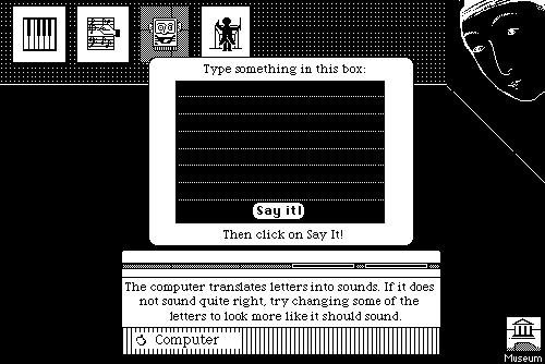
metaphor of a talking computer in the context of a "Sound Room"to allows kids to explore what computers can do with sound. The Sound Room places speech synthesis in the context of a room within the larger museum interface. Text is typed onto a computer screen (on the computer screen) to emphasize to kids that the computer is doing the talking. Paintings on the wall of the Sound Room permit navigation and provide feedback about which room they are in. The Sound Room context is consistent across several different interactive experiences. This example is incredibly recursive, but serves to demonstrate the value we place on context. By putting a computer into the sound room, we maintain the context of the sound room. The interface below, "Speech Lab"(HyperMacinTalk, 1987), is a more typical HyperCard interface using buttons and fields on a background.
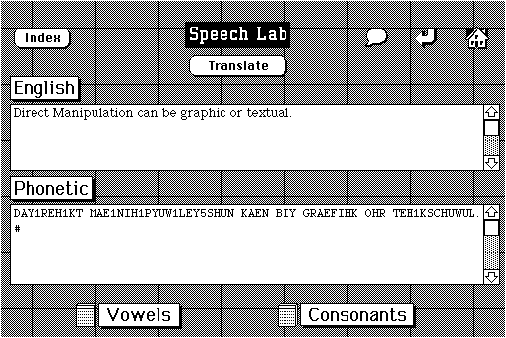
Figure 6 shows a final example of context versus straight buttons.
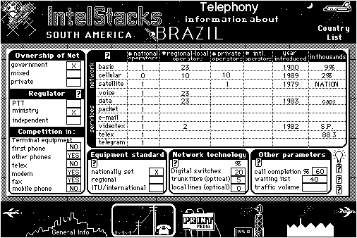
Within each card, the bottom panel of choices moves the user from one section of the IntelStacks international telecommunication database to another (from general information telephony to print media to broadcasting). This example is more ambiguous than the previous two.
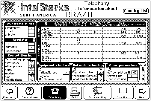
The contextual, top screen is less obvious than the buttons below, but conveys more subtle sense that the data derive from and are an integrated component within real country.
Consideration and design of contexts, rather than just interfaces, will become increasingly critical as computer technology progresses.
Hutchins et al. (1986) define DM as a "feeling of involvement with a world of objects rather than with intermediaries." According to Mountford (1990), "architecture and interface design have an important goal in common: to create livable, workable, attractive environments."Virtual realities, in which users, perhaps wearing goggles, data gloves and body suits are immersed in a computer generated environment provide an extreme example of an involving interface. There is whole body involvement. The users can see "their own"hand or body moving in the environment. The visual and auditory information responds to head movement to further the illusion that the user is moving inside of a world of objects. These attributes refer to perceptual attributes of involvement. In more immediately feasible interfaces, perceptual involvement is invoked by types of interface devices (e.g., mice, touch screens) and responsiveness of the system (e.g., feedback, speed, environmental cues). An element of DM which has been largely ignored is the use of sound to enhance feelings of involvement. In the physical world we are surrounded by auditory cues which at an unconscious level signal the occurrence of events in the environment: pen cap opening, car accelerating, door closing, key turning, computer turning on, etc.
Virtual reality also relies on conceptual involvement, returning again to the idea of metaphor. "There is a major movement towards the development of virtual and metaphoric/alternative realities that will create stronger links between the user and the problem environment as modeled by the computer system"(Spring, 1990). Spring writes of a need to create "visual metaphors for mental models for idea organization."This might involve visualizing theories of how humans process and store ideas. Metaphor can also convey a sense of place or landmark, provide progress indicators and a sense of consistency across different parts of the interface (Rosendahl-Kreitman, 1990).
Rafaeli (1990) empirically demonstrated that an ugly DM interface can be effective. He did not, however, compare the ugly interface he designed to a beautiful DM interface. A looming question for designers is what difference glitz, context, metaphor and responsiveness make. Design guidelines periodically start sentences with the phrase "aesthetics aside,..."Virtual reality magnifies the issue, making it apparent that one is designing an environment. It seems absurd to don goggles and gloves to enter a barren, 2-dimensional world of buttons and fields scattered clumsily in space. The relationship between form and function bears study in the context of interface design.
In another approach to involvement, Norman (1988) distinguishes "third person," command-mode operations from "first-person," DM interactions. On a micro level, first person implies using a mouse To move objects instead of typing a command which says move the circle 20 pixels to the left. First person differentiates modern tool-based interfaces from earlier interfaces which allowed only limited interaction. While programming languages have traditionally been non-DM interfaces, object-oriented programming adds DM attributes to the programming environment. By locating script within objects, a programmer begins to feel involved with a world of objects (of her own creation), sending commands from one to another. The distinction between programming and DM begins to blur.
First person also differentiates DM from an new class of interface techniques known as agenting. Alan Kay (1990), inventor of the object oriented language, Smalltalk and central designer of the Mac interface, describes agenting:
The Mac interface is tool-based. A tool is something you look at and control. Manipulation is a very important part. Agenting is where you get somebody else to do your goals for you. And we are a species that is interested in getting our goals cloned, and we are also willing to have goals cloned into us... An agent is something that looks at you, [something] you manage. In 10 years we will be hooked up to more than a trillion objects of useful knowledge, and no direct manipulation interface can handle that. Instead, [the interfaces] are going to be 24-hour retrievers that are constantly firing away doing things.
In advocating DM, Norman proposes that there are times when agenting is not appropriate. "...If the job is critical, novel, or ill-specified, or if you do not yet know exactly what is to be done, then you need direct, first-person interaction. Now direct control is essential, an intermediary gets in the way."However, agenting is a response to complexity, where direct control is not a reasonable option. DM is threatened by complexity until a new level of organization is achieved. It is possible that agents could serve as an organizing factor within a DM interface.
The most commonly cited but rarely explicated example of DM is driving a car (Schneiderman, 1987; Norman, 1988; Rafaeli, 1990).
Driving a car feels good. Csikszentmihaly (1990) has been studying happiness for more than a decade, and has arrived at the concept of "flow"to describe the commonalities shared by many people's self reports of optimal experiences. In a finding which surprised even them, Csikszentmihaly and LeFevre (1989) discovered that the largest source of flow (optimally enjoyable experiences where the individual feels involved and in control) in leisure time for managers, blue collar and clerical workers was driving (21-26% of leisure time flow-like experiences), followed closely by talking to friends and family (18 -23%). Watching television accounted for 7 - 9% of leisure time flow-like experiences.
If using an interface could be like driving a car then we wouldn't have to learn a new system. Familiarity is high. Visibility is high. There are 4 or 5 windows open at the same time. The main window consists of front and side windshield. The control palette consists of breaks, gas, shift, steering wheel and instrument panel. There are 3 stacks that show you where you have been (the rear and side view mirrors). Although all windows are on the screen concurrently, only one can be active (attended to) at a time, so the user must switch among them while driving. Responsiveness and feedback are abundant, including speedometer, visual motion cues, auditory cues and the feeling of motion. Hands, feet, eyes and ears are involved in the interface, and they take action without an intermediary.
As we increasingly use computers to navigate informational spaces, it is natural to wish for a familiar, powerful, pleasing interface. In some ways, driving is an unreasonable analogy. Driving is supported by a nation-wide infrastructure of highways, gas stations, maps, rules, icons, signs and police. Driving is very structured and rule-bound, all of which needs to be learned (this side of the road, always stop at a stop sign, this fast here, no U turn, no parking). It is highly unlikely that in the near future there will be parallel standardized information infrastructures to make it easy to navigate. Furthermore, driving offers a very limited set of actions.
Like driving but better, flying in Virtual Reality feels good. A problem with real time navigation through physical or virtual space, either by driving or flying, is that it takes a long time to get from one place to another. Of course, there are no speed limits in computer space other than those imposed by system limitations. No user will navigate on computer for 13 hours to reach a desired chunk of information. Driving serves as a good exemplar of some aspects of DM in a limited choice situation, it is not as simple as it seems, nor is it particularly generalizable. The best feels-good-involving DM system will not necessarily be a direct simulation of the real world driving. Some hybrid interface which maintains the pleasure and freedom of motion but compresses navigation time is needed.
Laurel (1991) asks designers to consider the concept of direct engagement, rather than direct manipulation. Direct engagement involves the design of experiences with attention to emotional and cognitive values. It implies that the design of interfaces and applications should be a single, integrated process. Her concepts for the future of human interface design are consistent with those presented here about DM.
The case is made here for consideration of DM as a complex, compound construct. Some components of interfaces will use DM principles, even when agents or command components are also present. Designers are urged not just to simulate real world experiences on computer, but to design contexts, environments and virtualities for users to enter which go beyond real world constraints.
Graphics will play an increasingly important role in enhancing interface design. It is harder to design a superb graphical DM interface than a superb DM text interface, but a well designed DM interface which includes graphics is likely to surpass a well designed text-only DM interface in terms of visibility and involvement.
An interesting question arises considering Figures 2, 4, 5 and 6. I showed each set to several designers, asking of the top and bottom interfaces, is this GUI? General consensus was that the top interfaces in each figure were "GUI-er"than the bottom interfaces. All were deemed DM interfaces. In virtual realities, with agents, and with other future DM interfaces, the prediction is that the computer worlds will get GUI-er and GUI-er.
Apple Computer. "Human Interface Guidelines: The Apple Desktop Interface,"Addison-Wesley Publishing Co., Inc.: Reading, MA, 1987.
Chen, Michael and Leahy, Frank. "A design for supporting new input devices,"in B. Laurel, Ed., The Art of Human Computer Interface Design, Addison Wesley Publishing Co., Inc.: Reading, MA, pp. 299-308, 1990.
Csikszentmihaly, Mihaly. Flow: The Psychology of Optimal Experience. Harper and Row: New York, NY, 1990.
Csikszentmihaly, Mihaly and LeFevre, Judith. "Optimal experience in work and leisure,"Journal of Personality and Social Psychology, Vol. 56, No. 5, pp. 815-822, 1989.
Erickson, Thomas. "Working with interface metaphors,"in B. Laurel, Ed., The Art of Human Computer Interface Design, Addison Wesley Publishing Co., Inc.: Reading, MA, pp. 65-75, 1990.
Heeter, Carrie and Gomes, Pericles. "Next generation hypermedia: It's time for talking pictures,"unpublished manuscript, Comm Tech Lab, Michigan State University, 1991.
Hutchins, E.L., Hollan, J.D., and Norman, D.A. . "Direct manipulation interfaces," in Norman, D.A. and Draper, S.W. (Eds.) User Centered System Design: New Perspectives on Human-Computer Interaction. Hillsdale, NJ: Lawrence Erlbaum Associates, 1986.
HyperMacinTalk. Stack designed by Dennis C. Demars, 1988.
IntelStacks. An international telecommunication database hypermedia project, directed by Dr. Joseph Straubhaar and designed by Pericles Gomes and Carrie Heeter, Comm Tech Lab, Michigan State University, 1990.
Kay, Alan. "On the next revolution," BYTE, p. 241, September, 1990.
Laurel, Brenda. Computers as Theatre. Addison Wesley Publishing Co., Inc.: Reading, MA, 1991.
Microsoft Corporation. "The benefits of Graphical User Interface,"Multimedia Review, Volume 1 #4, pp. 10-17, winter, 1990.
MacroMind Director Interactivity Manual. MacroMind, Inc.: San Francisco, 1990.
MicroExploratorium Sound Room. A research project to bring museum experiences to classrooms. Patrick Dickson, Principle Investigator; software designers, Carrie Heeter and Pericles Gomes, Comm Tech Lab, Michigan State University, 1990.
Mission to Mars!. (CD-Rom) Comm Tech Lab, Michigan State University, Heeter, Carrie & Gomes, Pericles, designers, 1990.
Mountford, Joy. "Tools and techniques for creative design,"in B. Laurel, Ed., The Art of Human Computer Interface Design, Addison Wesley Publishing Co., Inc.: Reading, MA, pp. 17-30, 1990.
Nelson, Ted. Literary Machines. Mindful Press: Sausalito, CA, 1990.
Norman, Donald. The Psychology of Everyday Things. Basic Books, Inc., Publishers: New York, 1988.
Oren, Timothy. "Designing a new medium,"in B. Laurel, Ed., The Art of Human Computer Interface Design, Addison Wesley Publishing Co., Inc.: Reading, MA, pp. 467-480, 1990.
Rafaeli, Sheizaf. "Semantics over syntax: Construct-validating direct manipulation in human-computer interaction," presented at the International Communication Association annual convention, Dublin, Ireland , June, 1990.
Rafaeli, Sheizaf. "If the computer is the medium, what is the message: Explicating interactivity" presented at the International Communication Association annual convention, Honolulu, May, 1985.
Rosendahl-Kreitman, Kristee. User Interface Design, Multimedia Computing Corp.: Santa Clara, CA, 1990.
Schneiderman, Ben. "Direct manipulation: A step beyond programming languages,"IEEE Computer 16, 8 pp. 57-63, August, 1983.
Schneiderman, Ben. Designing the User Interface: Strategies for Effective Human-Computer Interaction. Addison-Wesley Publishing Company: Reading, MA, 1987.
Spring, Michael. "Informating with virtual reality,"Multimedia Review, Volume 1 #2, pp. 5-13, summer, 1990.
Tognazzini, Bruce. "Principles of multimedia visible interface design,"Multimedia Review, Volume 1 #4, pp. 18-22, winter, 1990.